
Discover 9 powerful visual storytelling techniques to captivate your audience. Learn how to use color, composition, and more to create compelling narratives.
Our brains process images 60,000 times faster than text. That’s not just trivia-it’s why visual storytelling techniques matter so much for marketers, educators, and creators. When done well, these techniques turn abstract ideas into memorable experiences that capture attention and drive action.
At VideoQi, we’ve helped hundreds of teams create interactive video content. Along the way, we’ve learned which visual storytelling methods actually move the needle. This guide covers 9 techniques we use with our clients-from cinematic framing to data visualization-with concrete steps you can implement today.
You’ll learn how to:
- Structure visual narratives for maximum impact
- Evoke specific emotions through deliberate color choices
- Build a visual language that resonates with your audience
1. Sequential art and comic book layouts
Sequential art uses a series of images in deliberate order to tell a story. Originally from comics, this technique now powers everything from Instagram carousels to complex instructional guides. Its strength: controlling narrative pacing and simplifying complex information.
By breaking a story into distinct frames or panels, you guide viewers step-by-step. The size and arrangement of panels influence the experience-small, uniform panels create quick rhythm, while a large dramatic panel freezes a moment in time.
How to use it
- Storyboard first. Before creating visuals, map out your entire sequence. Define the key moment for each frame to ensure logical, compelling flow. This works for tutorials, product demos, and brand stories.
- Vary your panel layout. Avoid monotonous grids. Mix panel sizes to create visual interest and control pacing. A full-bleed image establishes a scene; narrow vertical panels build suspense.
- Use the gutter. The space between panels matters. A wider gutter indicates time passing or a location shift, giving viewers a moment to process.
When I design onboarding sequences for VideoQi clients, I often use sequential layouts to break down multi-step processes. Each frame must serve a purpose-advancing the plot, revealing character, or explaining a concept. This discipline makes narratives stronger.
2. Color psychology
Color psychology uses deliberate color choices to evoke specific feelings and guide audience perception. It leverages deep-seated psychological and cultural associations to establish mood and shape emotional journeys-without words.

Think of Tiffany’s robin’s egg blue (luxury, exclusivity) or Coca-Cola’s red (energy, excitement). Director Wes Anderson uses meticulously crafted palettes to define entire emotional landscapes, making color a character in itself.
Practical application
- Apply the 60-30-10 rule. Use a dominant color for 60% of visual space to set overall tone, a secondary color for 30% to add contrast, and an accent color for 10% to highlight CTAs.
- Consider temperature. Warm colors (reds, oranges, yellows) evoke energy and passion-good for product launches. Cool colors (blues, greens) feel calm and trustworthy-ideal for B2B services or healthcare.
- Research cultural context. White signifies purity in Western cultures but mourning in many Eastern cultures. Know your audience.
At VideoQi, we’ve A/B tested color palettes in interactive videos for e-commerce clients. Switching from a cool blue to a warm orange CTA button increased clicks by 23% in one campaign. Small changes in color can drive measurable results.
3. Typography as visual narrative
Typography treats text not just as information delivery, but as a visual element. Font choice, size, spacing, and arrangement evoke emotion and establish personality. The right typography makes your message feel authoritative, whimsical, modern, or classic before a single word is fully read.
Netflix’s bold typeface communicates cinematic confidence. The New York Times’ elegant serifs convey tradition and credibility. Disney’s hand-lettered logo adds warmth and whimsy.
Implementation tips
- Choose fonts with personality. A sleek sans-serif suits tech products; a warm, rounded font works for non-profits. Align typeface with your brand’s voice and the story’s emotional tone.
- Establish clear hierarchy. Limit yourself to 2-3 font families. Differentiate headings, subheadings, and body text with size, weight, and style to guide the reader’s eye logically.
- Prioritize accessibility. Ensure sufficient color contrast between text and background. Test across devices and screen sizes for legibility.
Typography is the body language of your text. It sets tone and builds trust subconsciously.
4. Visual metaphors and symbolism
Visual metaphors use images to represent abstract concepts that are difficult to depict literally. This creates deeper meaning by tapping into shared cultural understandings, allowing you to communicate complex messages in a single memorable visual.
Instead of explaining “security” with words, show a lighthouse-instantly conveying guidance, safety, and reliability. Financial services use mountains for stability. Environmental campaigns use melting ice for urgency.
How to implement
- Audit your core message. What abstract idea are you communicating? Growth, innovation, trust, speed? Brainstorm objects, animals, and scenes universally associated with that concept.
- Research cultural nuances. A white dove signifies peace in Western cultures, but symbolism varies dramatically across regions. Research your market.
- Layer symbols. Combine multiple symbolic elements to strengthen your message. A growing plant with upward arrows reinforces financial growth and forward momentum.
The best visual metaphors feel both familiar and novel-leveraging a well-understood symbol but presenting it in a unique context that connects specifically to your brand.
5. Cinematic composition and framing
Cinematic composition arranges visual elements within a frame to guide the viewer’s eye and evoke specific emotional responses. Using camera angles, lighting, and framing, you transform simple images or video clips into narrative moments.

Apple uses dramatic, low-key lighting to create prestige. Nike uses low-angle shots to make athletes appear heroic. These choices direct attention, establish relationships between subjects and environment, and add professional polish. Understanding B-Roll can add depth to your compositions-this guide on B-Roll examples explores the concept further.
Techniques to try
- Use the rule of thirds. Divide your frame into a 3×3 grid. Place key subjects along these lines or at their intersections for more balanced, dynamic composition than simple center placement.
- Experiment with angles. Low angles looking up convey power and importance. High angles looking down make subjects seem small or vulnerable. Eye-level creates direct, personal connection.
- Control depth of field. Shallow depth (blurry background) isolates your subject. Deep depth keeps everything in focus-ideal for establishing scenes. These choices align with established multimedia learning principles for clarity.
Every compositional choice is a narrative choice. The way you light, frame, or position the camera informs the audience’s subconscious interpretation.
6. Data visualization
Data visualization transforms complex statistics into digestible graphics. This technique turns abstract numbers into accessible narratives through charts, graphs, and infographics-making overwhelming information clear and engaging.
From Hans Rosling’s animated population statistics to Spotify Wrapped’s personal data stories, visualization reveals patterns that would be lost in spreadsheets. By combining design principles with data analysis, you guide audiences to specific conclusions.
Best practices
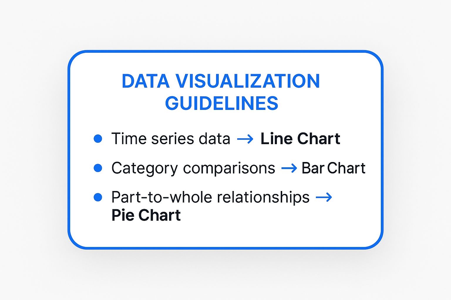
- Start with the narrative. Before selecting a chart type, define the single most important message. Is it a trend over time? A comparison between categories? A part-to-whole relationship? Start with the story, then find supporting data.
- Design for clarity. Use consistent color schemes and clear visual hierarchy. Every element should make data easier to understand, not just prettier.
- Provide context. Raw numbers rarely mean much alone. Frame data with benchmarks, historical context, or comparisons. This turns statistics into insights.
Choosing the correct chart type is critical for audience interpretation. When you need to showcase ROI, illustrate trends, or create training materials that quantify performance, data visualization provides undeniable clarity.
7. Character design
Character design creates memorable personas that visually embody brand values and personality. Characters like the Geico Gecko or Mailchimp’s Freddie serve as narrative vehicles, making brands more approachable and human.
A well-designed character acts as a consistent brand ambassador across all channels. Soft, rounded shapes convey friendliness; sharp, angular designs suggest precision and strength. This immediate visual language builds emotional shortcuts between brand and audience.
Design principles
- Align personality with brand values. Before sketching, define core personality traits. Are they a wise mentor, cheerful guide, or quirky expert? These must reflect your brand’s mission and resonate with your audience.
- Prioritize simplicity and scalability. A great character is recognizable even at favicon size. Avoid overly complex details. Tony the Tiger’s bold, simple design is instantly identifiable on a crowded cereal aisle.
- Create a style guide. Document official colors, proportions, poses, and expressions to maintain consistency across platforms and campaigns.
A character isn’t just a logo-it’s a storyteller. Its purpose is to foster emotional connection and make your brand story memorable.
8. Environmental storytelling
Environmental storytelling embeds narrative within a space, allowing audiences to uncover the story through exploration. Instead of being told directly, viewers piece it together from clues-architecture, object placement, ambient details.
The Apple Store’s clean lines, natural materials, and open layout tell a story of simplicity and innovation without a single word. Video games like BioShock reveal dystopian history through decaying posters, audio logs, and graffiti.
How to create immersive environments
- Map the narrative journey. Define your story and identify key beats. Design the space-whether webpage or retail store-so a user’s natural exploration path reveals these beats in sequence.
- Use sensory cues. Leverage lighting, color, sound, and texture to establish and shift moods. Dim, warm lighting creates intimacy; a website’s shift to darker tones can signify more serious content.
- Embed “show, don’t tell” elements. Populate environments with details that imply story. A worn-out armchair facing a window suggests contemplation; an abandoned shopping cart tells a story of distraction.
A well-designed environment makes audiences feel like archaeologists, not tourists. Every element should contribute to the larger narrative.
9. Motion graphics and animation
Motion graphics infuse static designs with life, transforming them into dynamic narratives. Movement, timing, and visual effects guide the viewer’s eye, explain complex ideas, and evoke emotion.
A simple fade signifies time passing. An animated icon draws attention to a critical feature. Headspace uses calming, slow-paced animations for tranquil UX; TED-Ed uses fast, crisp motion for educational excitement.
Getting started with motion
- Learn the 12 principles. Disney’s foundational animation principles still apply. “Squash and stretch” makes objects feel tangible; “easing” (slowing in/out of movement) creates natural motion instead of robotic transitions.
- Animate with purpose. Every movement should have a reason-guiding users to the next step or illustrating cause-and-effect. Avoid superfluous animations that distract from your message.
- Consider performance and accessibility. Complex animations increase load times. Provide options to reduce motion for users with vestibular disorders.
Well-executed animation feels invisible-seamlessly guiding audiences through the story. When you add motion to visuals, you make stories not just seen, but felt. These principles are key when you learn to create interactive video that captivates.
Comparing these techniques
| Technique | Complexity | Best For | Key Advantage |
|---|---|---|---|
| Sequential Art | Medium-High | Brand storytelling, tutorials, social media | Excellent pacing control |
| Color Psychology | Low-Medium | Branding, marketing, UI design | Universal emotional influence |
| Typography | Medium | Branding, editorial, digital content | Cost-effective visual interest |
| Visual Metaphors | Medium | Logos, campaigns, storytelling | Transcends language barriers |
| Cinematic Composition | High | Photography, video, advertising | Guides attention, builds atmosphere |
| Data Visualization | Medium-High | Reports, education, marketing | Makes data accessible |
| Character Design | Medium-High | Branding, mascots | Builds relatability |
| Environmental Storytelling | High | Retail, exhibitions, VR/AR | Creates memorable experiences |
| Motion Graphics | High | Explainers, product demos, apps | Captures attention, simplifies complexity |
Putting it all together
These nine visual storytelling techniques form a toolkit for creating compelling narratives. But mastery doesn’t come from applying them in isolation-it emerges from artfully combining elements into a cohesive whole.
Imagine building a product demo video. Use cinematic composition to frame your product aspirationally, motion graphics to highlight features with clean animations, and color psychology to evoke trust and efficiency. This multi-layered approach transforms a simple demonstration into an engaging experience.
For a B2B campaign presenting complex data, leverage data visualization to create an interactive infographic. Add typography as visual narrative to guide the viewer’s eye and emphasize insights. Layer in environmental storytelling through background imagery to contextualize the data.
Your next steps
Don’t try implementing all nine at once. For your next project:
- Select 2-3 core techniques based on your message and audience. For an e-commerce launch, this might be character design and visual metaphors.
- Storyboard with intention. Before creating anything, map your visual sequence. At each stage, ask: How can color enhance emotion here? What framing highlights this feature? How can typography clarify my CTA?
- Gather feedback and iterate. Share drafts with colleagues or a small audience segment. Ask specific questions about your chosen techniques. Did the color scheme make them feel a certain way? Was the data visualization easy to understand?
- Analyze and elevate. After completion, analyze performance. Then either refine the same techniques or introduce a new one from this list.
This process turns abstract principles into a repeatable workflow for creating consistently effective content.
Ready to elevate your visual storytelling from static presentation to dynamic conversation? VideoQi lets you embed interactive elements like polls, quizzes, and clickable hotspots directly into videos, turning passive viewers into active participants. Try VideoQi today.


