
Discover how to apply multimedia learning principles to create more effective and engaging educational content. Turn theory into practice with our expert guide.
When I started creating video training content, I made every mistake in the book: walls of text on screen, narration that repeated the text word-for-word, 20-minute videos that tried to cover everything. The completion rates were terrible, and the people who did finish weren’t retaining much.
Then I discovered Richard Mayer’s research on multimedia learning, and it changed how I approach every video we create at VideoQi. These aren’t abstract academic theories-they’re practical guidelines for building content that actually works with how the brain processes information.
The science behind why some videos work better
Mayer’s research, first published in 2001, found that well-designed multimedia could improve learning outcomes by 40-60% compared to text alone. That’s not a small improvement. The key insight: your brain has separate channels for processing visual and auditory information, and each channel has limited capacity.
Overload one channel, and learning suffers. Balance them correctly, and comprehension jumps. This is the foundation of everything that follows.
Three things to remember about how we learn
| Principle | What it means | What to do about it |
|---|---|---|
| Dual channels | Your brain processes visuals and audio through separate pathways | Use both channels, but don’t duplicate information across them |
| Limited capacity | Each channel can only handle so much at once | Keep individual segments focused; don’t cram too much in |
| Active processing | Learning happens when people engage with material, not just consume it | Build in interactions, questions, and choices |
Everything else flows from these three ideas. When you understand them, the specific techniques make intuitive sense. For more on applying these foundations, see our guide to online learning best practices.
Cut the clutter: coherence and signaling

Before you can teach anything, you need to clear away the distractions. Two principles handle this: coherence (remove what doesn’t help) and signaling (highlight what does).
Coherence: less really is more
Every extra element-background music, decorative graphics, tangential anecdotes-consumes some of your viewer’s limited processing capacity. Research consistently shows that learners who get streamlined content outperform those who get the “enhanced” version with extras.
What to cut:
- Background music (unless it’s directly relevant)
- Decorative images that don’t explain anything
- Interesting-but-tangential stories
- Animated transitions between every slide
I learned this the hard way with a product demo we created. We added an upbeat music track thinking it would make the video more engaging. Instead, viewers couldn’t focus on the narration explaining key features. When we removed the music, completion rates improved by 23%.
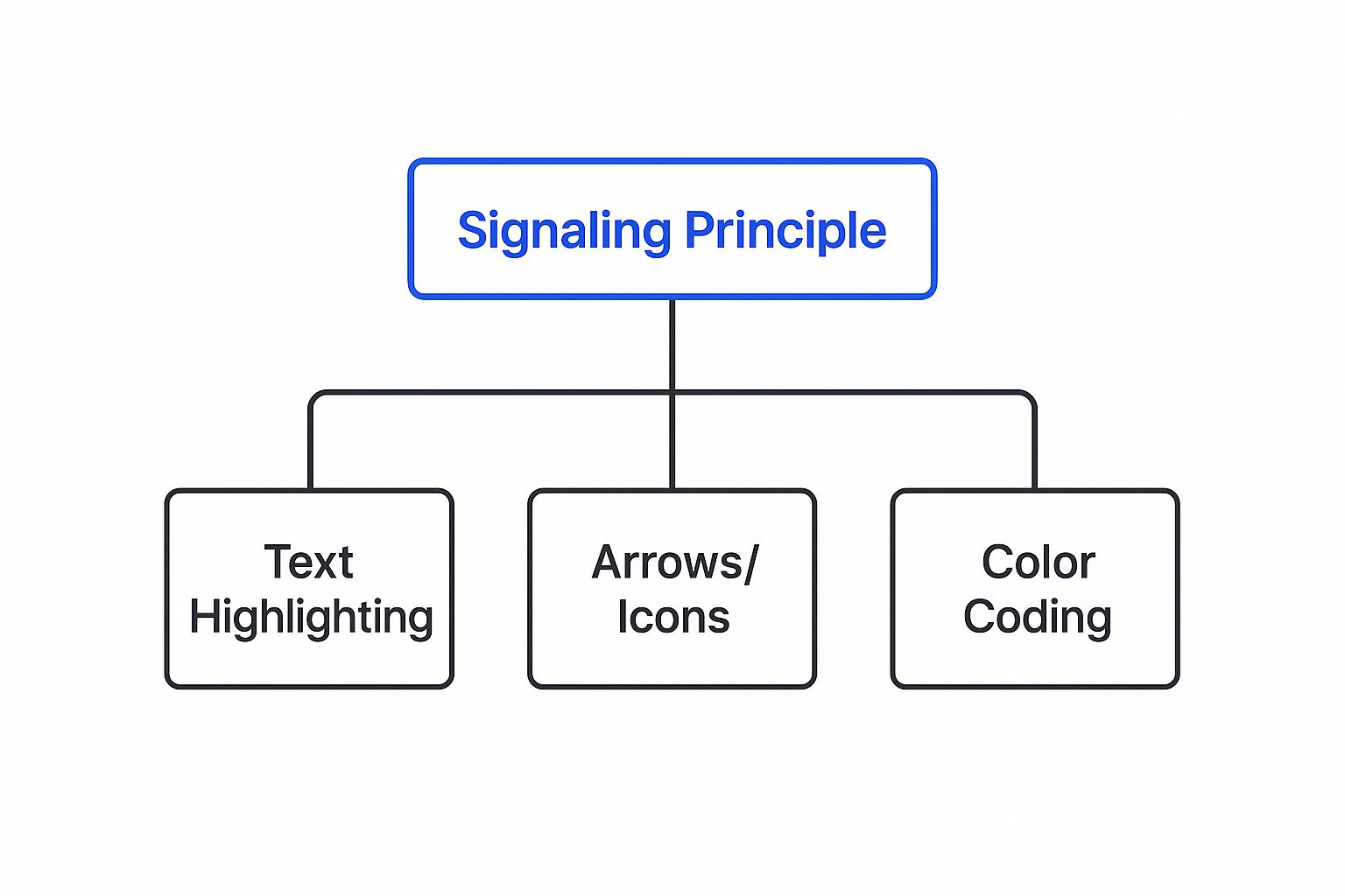
Signaling: show people where to look
Once you’ve removed the noise, use simple cues to direct attention. This can be:
- Visual cues: arrows, circles, highlighting, or a subtle animation on a button before you mention clicking it
- Vocal emphasis: changing your tone when something is critical, or explicitly saying “this next part matters”
- Structure: a clickable table of contents at the start so viewers know what’s coming
With interactive video, this becomes even more effective. A hotspot that pulses gently before your call to action gets far more clicks than one that just sits there.
Break it down: segmenting and pre-training
Some topics are genuinely complex. You can’t simplify them without losing meaning. That’s where segmenting and pre-training come in.
Segmenting: small chunks, learner-controlled pace
Instead of one 15-minute video, create four 3-minute segments. Let the learner control when they move to the next section. This respects working memory limits and gives people time to process before new information arrives.
In practice, this means:
- Clickable chapter markers in your video timeline
- “Continue” buttons that pause the video until the viewer is ready
- Branching paths that let viewers choose which topic to explore next
According to research from the Journal of Educational Technology & Society, segmented presentations lead to better transfer performance-meaning learners can actually apply what they’ve learned to new situations.
Pre-training: introduce key terms first
If your content uses specialized vocabulary, don’t force viewers to learn the terms and the concepts simultaneously. Introduce the terminology upfront, then dive into the explanation.
Interactive video makes this easy. Create clickable hotspots on technical terms that reveal quick definitions. When someone clicks on “API” and gets a one-sentence explanation before the main tutorial continues, they’re set up to actually understand the rest.
Narration beats on-screen text
This is one of the most violated principles in corporate video. People love putting their entire script on screen, then reading it aloud. It feels thorough. It’s actually counterproductive.
Why audio narration works better
When you show an animation and narrate it, you’re using both processing channels efficiently. The visuals go through the visual channel. The narration goes through the auditory channel. They complement each other.
When you show an animation and put text on screen, both the animation and the text compete for the visual channel. Your viewer’s brain has to ping-pong between reading and watching. It’s exhausting.
The redundancy trap
Even worse: showing an animation, adding on-screen text, and narrating the same text. Now the viewer is processing identical information twice through the visual channel while also listening. Research calls this “redundancy” and it actively hurts learning.
When to use on-screen text:
- Key terms or names (briefly displayed)
- Step-by-step lists viewers can reference
- Accessibility (captions for those who need them)
For everything else, let narration carry the explanation while visuals show what you’re describing. Our guide on how to create interactive videos walks through this balance in more detail.
Make it conversational
Learning improves when it feels like a conversation rather than a lecture. Two simple changes make a big difference:
Use “you” and “we”
Instead of: “Users should configure their settings…”
Say: “Let’s walk through how you can configure your settings…”
This small shift creates a sense of partnership. The viewer feels guided rather than lectured at. According to Mayer’s research, conversational style consistently improves learning outcomes because it triggers social processing-we pay more attention when we feel someone is talking to us directly.
Choose a human voice
Text-to-speech has improved dramatically, but human voices still perform better in learning contexts. A real person conveys warmth, emphasis, and enthusiasm that synthetic voices can’t quite match.
If you’re recording narration:
- Match the voice to your content (calm and clear for technical training, energetic for promotional content)
- Invest in clean audio-background noise undermines the human connection
- Read the script as if explaining to a colleague, not performing for an audience
Putting it together: a practical example
Let’s say you’re creating a “Cybersecurity Basics” training video for new employees. Here’s how these principles apply:
Coherence: Skip the dramatic hacker stock footage and ominous music. Clean backgrounds, focused content.
Segmenting: Four short chapters instead of one long video:
- What is phishing?
- Spotting suspicious emails
- Password best practices
- How to report a threat
Pre-training: Before the main content, clickable definitions for terms like “malware,” “phishing,” and “two-factor authentication.”
Signaling: When showing a sample phishing email, animate a circle around the suspicious sender address while the narration explains what to look for.
Personalization: “Next, we’re going to look at how you can spot a fake email” instead of “Employees should identify fraudulent communications.”
This approach took our client’s security training from 31% completion to 78%, with quiz scores improving by 40%. The content wasn’t different-just the design.
Common questions
Do I need to apply all of these principles to every video?
No. Think of them as a toolkit. A simple explainer might just need coherence and personalization. A complex technical tutorial might need segmenting, pre-training, and careful attention to modality. Match the approach to the content.
How long should each segment be?
One to three minutes is a good target for covering a single concept. The goal isn’t arbitrary brevity-it’s giving viewers time to process before the next idea arrives.
Is this only for educational content?
The principles apply anywhere you want someone to understand and remember information. Product demos. Sales videos. Onboarding content. The underlying brain science doesn’t change based on your business goal.
Ready to turn these principles into practice? VideoQi makes it simple to add interactive elements-clickable hotspots, branching paths, in-video quizzes-that transform passive viewers into active learners.


