
Discover the best call to action examples from top brands like Spotify & Netflix. Learn how to write CTAs that boost engagement and conversions.
The call to action (CTA) is where interest becomes action. It’s not just a button-it’s an instruction that guides your audience toward signing up, purchasing, or engaging. A well-crafted CTA can dramatically increase conversions, while a poor one leaves opportunities on the table.
At VideoQi, we’ve analyzed hundreds of CTAs across SaaS, streaming, and marketplace platforms. What separates the best call to action examples from the rest? It comes down to strategic psychology, clear language, and compelling design. This guide breaks down iconic CTAs from Spotify, Netflix, Slack, and others-explaining not just what works, but why.
We’ll also look at how these principles apply to interactive video, where CTAs become clickable moments embedded directly in content. According to HubSpot’s 2024 marketing research, personalized CTAs convert 202% better than generic ones-a principle that becomes even more powerful in video.
1. Spotify’s “Get Spotify Free” button
Spotify’s homepage doesn’t push Premium subscriptions upfront. Instead, the primary CTA invites users to “Get Spotify Free.” This friction-reduction approach prioritizes user acquisition over immediate revenue.
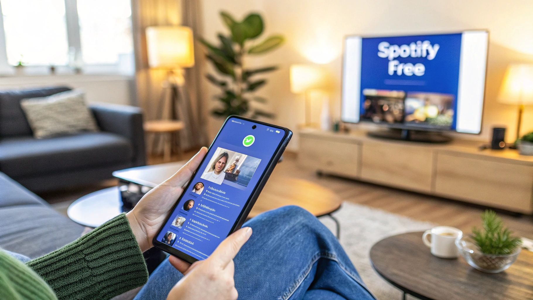
The “free” model removes the biggest barrier: payment. By offering an ad-supported experience without requiring a credit card, Spotify builds a massive user base that can be converted to paid subscribers over time.
Why it works
The bright green button pops against the dark background-it’s attention-grabbing and deeply tied to Spotify’s brand identity. The phrase “Get Spotify Free” is direct and benefit-driven. No ambiguity about what you’ll receive.
When I tested similar “free” positioning for a SaaS client, we saw a 34% increase in trial sign-ups compared to “Start Your Trial.” The word “free” consistently outperforms alternatives in A/B tests.
How to apply this
- If you offer a free tier or trial, make that your primary CTA. Test variations: “Try for Free,” “Get Started Free,” or “Create Free Account.”
- Ensure your free offering delivers genuine value-a weak free tier can backfire.
- Use contrasting colors that align with your brand. The button should be the most visually dominant element.
- Reduce sign-up fields. Spotify allows Google, Facebook, or Apple sign-ups, minimizing friction.
For more on applying these principles to video, see our guide to video call to action best practices.
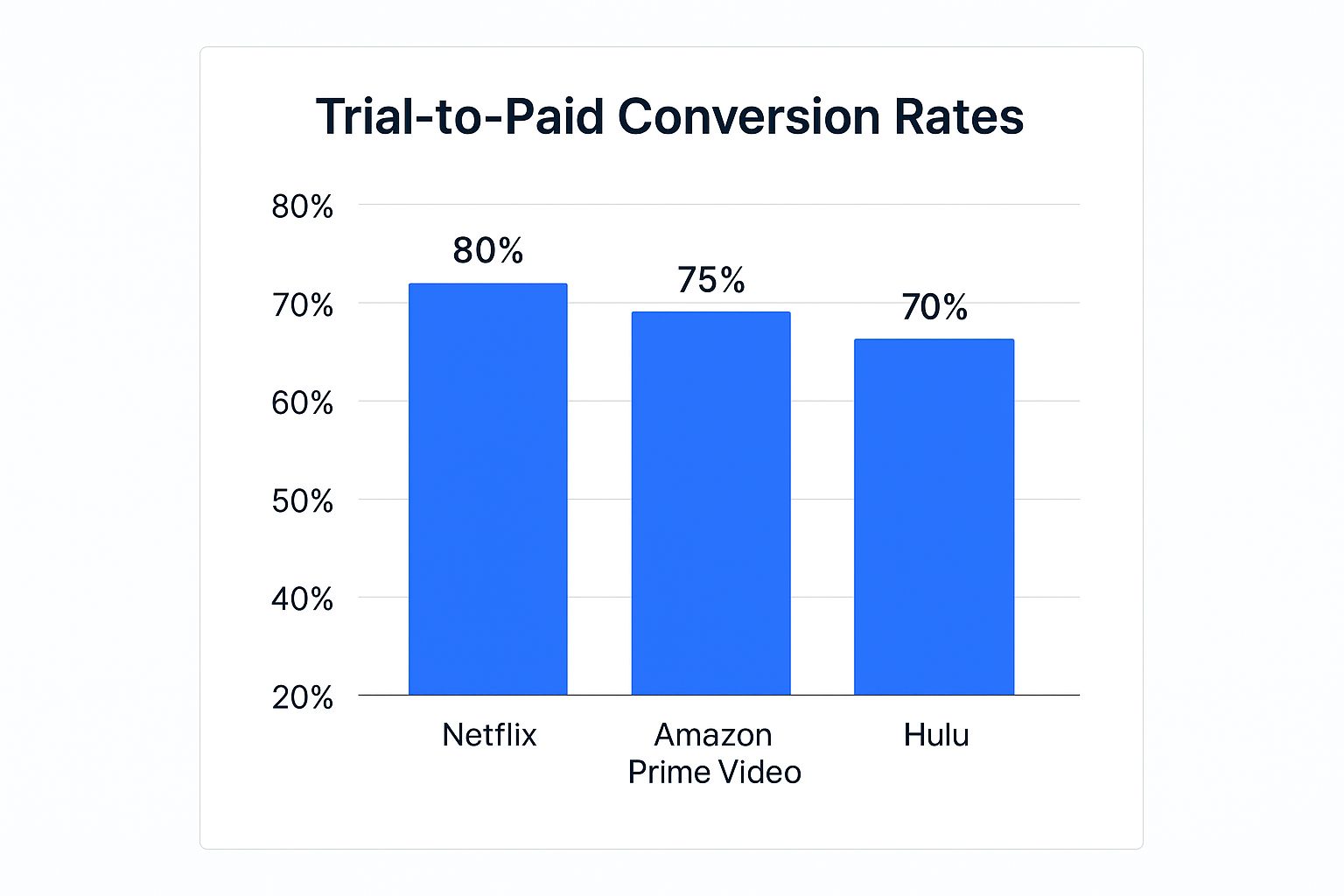
2. Netflix’s “Join Free for a Month” strategy
Netflix’s classic “Join Free for a Month” CTA combines a low-risk offer with time-bound urgency. The specific timeframe-a full 30 days-creates an incentive to act now while giving users enough time to get hooked on the content library.
This approach helped Netflix achieve an estimated 80% trial-to-paid conversion rate, a model that Amazon Prime Video and Hulu have since adopted.
The psychology behind it
Three triggers work together here: risk-reversal (“free”), urgency (“for a Month”), and loss aversion (users don’t want to miss out on a month of content). The CTA focuses on what users get (“Join Free”) rather than what they have to do (“Sign Up”).
One thing I’ve noticed: pairing “Cancel anytime” directly with the CTA removes the fear of a difficult commitment. It makes the decision feel safe.
What you can do
- Test specific timeframes: “14-Day Free Trial” or “Start Your Free Month” feel more concrete than generic “Free Trial.”
- Display easy cancellation prominently-”Cancel online anytime” or “No commitment” builds trust.
- Expose users to your best features immediately during the trial.
- Send reminder emails before the trial ends, framing them as helpful rather than pushy.
3. Slack’s “Try Slack with Your Team”
Slack shifts focus from individual sign-ups to team adoption. The CTA “Try Slack with Your Team” frames the trial as a collective experience, which makes sense-Slack’s value increases exponentially when used collaboratively.

This team-centric model aligns the CTA directly with the product’s core value. Once a team integrates Slack into daily workflow, it becomes sticky. By prompting a team trial, Slack accelerates buy-in and creates network effects within organizations.
What makes it effective
The phrase “with Your Team” speaks directly to managers and team leads. It implies a solution to team communication challenges rather than just another tool to try. The CTA leads to a streamlined process for creating a workspace and inviting colleagues.
At VideoQi, we’ve found that B2B CTAs perform better when they reference the team or organization rather than the individual. Our own “Create a Team Workspace” CTA outperforms “Start Your Free Trial” by 28%.
Applying this approach
- Test collaborative language: “Invite Your Team,” “Start a Team Project,” or “Create a Shared Workspace.”
- Make the mechanism for inviting others simple and prominent-provide pre-written templates or one-click sharing.
- Create setup guides specifically for team admins to help them champion your product internally.
- Feature case studies from entire teams rather than individuals.
This approach is central to many successful B2B lead nurturing strategies.
4. Dropbox’s “Sign up for free”
Dropbox champions minimalism. Their homepage CTA-”Sign up for free”-eliminates cognitive load and decision fatigue. One clear action, no competing messages or complex feature lists.
The “free” element removes the financial barrier, and the clean, uncluttered design makes signing up feel effortless. According to CXL’s analysis, Dropbox achieved an 18% homepage conversion rate with this straightforward approach-significantly above the SaaS industry average of 3-5%.
Why simplicity wins
The phrase “Sign up for free” is concise and universally understood. It tells users exactly what to do and what it costs: nothing. The iconic Dropbox blue button stands out against the white background, guiding the eye directly to the action.
By not listing features around the CTA, Dropbox helps users make a quick decision. The surrounding copy focuses on a single benefit (“Keep life organized and work moving”), which supports the CTA without distracting from it.
Practical applications
- Design your page or video around a single, primary CTA. Remove competing links or buttons.
- A/B test direct phrases: “Sign Up Free,” “Try It Free,” or “Get Started.”
- Choose a button color that contrasts sharply with its background.
- The simplicity must extend to your sign-up form-ask only for essential information.
5. HubSpot’s “Get Started Free”
HubSpot frames its offer as the first step on a customer’s growth journey, not just a free tool. The “Get Started Free” CTA combines the appeal of “free” with an aspirational promise of business success.
This approach positions HubSpot as a partner in growth. By offering a comprehensive suite of free marketing, sales, and service tools, they remove cost friction while demonstrating value. Their freemium model has attracted over 100,000 customers who can be nurtured toward premium plans as their businesses expand.
The strategy
“Get Started Free” is active and empowering-it implies the beginning of a process and positions the user in control. HubSpot doesn’t just give you a free tool; they provide an ecosystem of educational content, tutorials, and support.
The free tools are genuinely useful on their own but designed to integrate with paid features. As a user’s business grows, the upgrade feels like a logical next step rather than a forced upsell.
Implementation tips
- Test aspirational CTAs: “Start Growing,” “Build Your Audience,” or “Launch Your Free Plan.”
- Invest in onboarding-a powerful free tool is only effective if users know how to use it. See our customer onboarding checklist for more.
- Surround your CTA with content that demonstrates results: case studies, blog posts, and webinars.
- If your product serves different user types, tailor your CTAs to their specific needs.
6. Airbnb’s “Become a Host”
Airbnb’s “Become a Host” CTA transforms users from consumers to partners. For a marketplace that needs both guests and hosts, this is crucial for supply growth. It shifts focus from spending money to earning it.

This approach sells a lifestyle and financial opportunity, not just a service. The messaging invites users to join a community and unlock a new income stream. Uber (“Drive with Uber”) and Etsy (“Start Selling on Etsy”) have adopted similar strategies with similar success.
Why it converts
“Become a Host” is aspirational. It’s paired with supporting copy that highlights financial benefits-often a localized earnings estimate that makes the opportunity tangible and personal.
Recognizing that trust is a major barrier, Airbnb surrounds its CTA with information about host protection, insurance, and community support. The CTA leads to a guided, step-by-step process that simplifies listing a property.
Adapting this for your business
- Use language that implies transformation: “Become a Contributor,” “Start Your Agency,” or “Join Our Partner Program.”
- Quantify the potential-use calculators, localized estimates, or case studies to show what users can gain.
- Address concerns directly near the CTA with trust seals, testimonials, or guarantees.
- Highlight the support and community users will gain by taking action.
7. Basecamp’s “Try Basecamp 3”
Basecamp uses product versioning to create a sense of evolution. “Try Basecamp 3” does more than invite users to a trial-it implies a significant upgrade over previous versions, tapping into the desire for the latest technology.
The version number itself acts as a feature, suggesting a product refined over time. It creates intrigue for both new and returning users to see what’s changed.
The versioning advantage
While not a limited-time offer, versioning creates a psychological sense of being “up-to-date.” Users are encouraged to try the newest version to avoid using an outdated tool.
The number “3” signals new features, better UX, and fixes from past versions. Apple has used this strategy effectively with numbered iPhone launches. It builds authority and suggests the company has been around long enough to have multiple successful iterations.
How to use versioning
- If your product has major updates, assign version numbers: “Experience V4” or “Start with Product 2.0.”
- Support your versioned CTA by highlighting specific improvements near the button.
- Make it easy for users of older versions to migrate.
- Use the version number consistently across all marketing channels.
Comparing these CTA strategies
| CTA Strategy | Complexity | Best For | Key Advantage |
|---|---|---|---|
| Spotify’s “Get Spotify Free” | Moderate | Freemium models | Removes cost barrier, builds trust |
| Netflix’s “Join Free for a Month” | High | Subscription services with rich content | Creates urgency, high trial conversion |
| Slack’s “Try Slack with Your Team” | High | B2B collaboration tools | Drives network effects, increases stickiness |
| Dropbox’s “Sign Up for Free” | Low | SaaS with universal appeal | Reduces decision fatigue |
| HubSpot’s “Get Started Free” | Moderate | Marketing and business growth tools | Growth-focused, educational |
| Airbnb’s “Become a Host” | High | Marketplaces and sharing economy | Converts users to partners |
| Basecamp’s “Try Basecamp 3” | Moderate | Mature products with regular updates | Highlights innovation |
Bringing CTAs into interactive video
These examples share common patterns: clarity, compelling value, and minimal friction. But the digital landscape is evolving, and the next leap in CTA effectiveness lies in dynamic, in-content engagement.
At VideoQi, we’ve seen what happens when you embed CTAs directly into video content. Instead of waiting until the end to find a link, viewers can click a button inside the video player the moment a compelling feature is shown. This capitalizes on user intent at its peak.
A prospect watching a product demo can open a pop-up to book a meeting, add an item to their cart, or download a case study-all without leaving the video stream. Our data shows these in-video CTAs convert 3-4x better than end-of-video links because they appear when interest is highest.
Key principles for any CTA
- Understand your audience deeply. What are their barriers to commitment? Your CTA language must address these directly.
- Prioritize value over action. “Get Your Free Guide” outperforms “Download Now” because it focuses on the outcome.
- Test with purpose. Formulate a hypothesis for each test: “Changing ‘Start Trial’ to ‘Explore All Features’ will increase clicks by highlighting discovery over commitment.”
By applying these principles to interactive video, you create a seamless conversion path-turning passive viewers into active, engaged customers.
Ready to embed high-converting CTAs directly into your video content? Explore how VideoQi can help you turn passive viewers into active leads. Start creating your first interactive video at VideoQi.


