
Learn to create a video call to action that gets results. Our guide covers design, timing, and optimization to turn viewers into customers.
A strong video call to action is the secret sauce that turns someone just watching your video into a customer, a subscriber, or a new lead. It's the critical moment where you tell them exactly what to do next. Without it, even the most captivating video is just a beautiful, expensive dead end.
Why Your Videos Need a Powerful Call to Action
Let's be real-getting views is great, but it’s only half the story. A video without a clear next step is like a fantastic sales pitch that ends with a shrug. You've done all the work to grab their attention, but you haven't given them a way to act on it. The whole point is to guide that interest toward a meaningful business outcome.
The digital world is noisy, and your audience's attention is a hot commodity. Just hoping they'll hunt for a link in your video description is a recipe for disappointment. A clickable, in-video CTA cuts through the noise. It removes all the guesswork and friction, letting you capture their intent the very second they're most engaged.
From Passive Viewer to Active Participant
Think about how a well-placed, interactive CTA changes the entire dynamic. You’re no longer just broadcasting a message at someone; you're inviting them to interact. This subtle shift transforms a one-way monologue into a two-way conversation, making your audience feel like they're part of the experience.
This hands-on approach is what separates good videos from great ones. Imagine ending a product demo with a simple "visit our website." Now, compare that to a button popping up right on screen that says, "Get Your Free Trial Now." The second one is direct, immediate, and effortless for the viewer, which is why it works so much better. To really get a handle on this, it's worth taking the time to master video marketing for social media.
A video’s job isn't just to inform; it's to persuade. Your video call to action is the mechanism that translates that persuasion into a measurable business result, whether that’s a new lead, a sale, or a subscriber.
The proof is in the data. Adding a direct, clickable call to action right inside your video player doesn't just nudge the needle-it sends it flying.
Impact of CTA Integration in Videos
| Metric | Video Without Integrated CTA | Video With Integrated CTA |
|---|---|---|
| Click-Through Rate (CTR) | Very Low (Relies on description links) | High (Direct, in-video clicks) |
| Conversion Rate | Minimal | Significantly Increased |
| Lead Generation | Inconsistent / Low | Consistent / High |
| User Experience | Passive, Requires Effort | Interactive, Seamless |
As you can see, the difference is night and day. Simply embedding that CTA is one of the highest-leverage actions you can take to boost your video's performance.
The Undeniable Impact of Video
Video isn't a "nice to have" anymore; it's a core part of modern marketing. New data reveals that a staggering 95% of marketers consider video a vital part of their strategy, which is an all-time high. Why? Because it's incredibly effective at holding attention and driving action. You can dive deeper into these video marketing insights from Wyzowl.
But just making a video isn't the finish line. You have to explicitly tell your viewers what you want them to do. For anyone ready to put this into practice, our guide on how to add links to video breaks down the exact steps you need. By embedding a clear CTA, you're putting your video to work, turning casual interest into real, tangible results for your business.
Designing a Video CTA That People Actually Click

Let's be honest: a generic button slapped onto the end of a video isn't going to cut it. A truly effective video call to action is much more than that. It’s a thoughtful mix of psychology, smart design, and crystal-clear language that makes clicking feel like the most natural next step for your viewer.
Think of it less as an interruption and more as a helpful nudge, guiding them exactly where they need to go next.
The real magic starts with your words. Vague, lazy commands like "Submit" or "Click Here" are conversion killers. They don't inspire anyone or explain what's in it for them. You have to focus on the value. In fact, studies have shown that using a single, clear CTA can boost clicks by an incredible 371%.
For example, "Get Your Free Guide" works because it’s not a demand-it’s an offer. It tells the viewer precisely what they'll receive and frames the action as a benefit just for them. This shift in perspective is what gets people to move.
Crafting Compelling CTA Copy
The best CTA copy is a tiny masterclass in persuasion. It needs to be clear, build a sense of value, and gently push the user to act without sounding aggressive. I’ve seen tiny tweaks in wording make a huge difference in performance over the years.
Here are a few approaches I’ve found work exceptionally well:
- Focus on the Benefit: Don't just say "Sign Up." Try "Create My Account" instead. The first feels like a chore, while the second implies ownership and a personal experience.
- Use First-Person Language: This is a simple but powerful trick. A button that says "Get My Free Template" feels far more personal than "Get the Free Template." It's a small change, but it consistently bumps up conversion rates.
- Promise a Solution: Imagine you're a business owner. Which button is more tempting? "Contact Us" or "Scale My Revenue"? The second one speaks directly to a core desire, making it almost irresistible.
The goal is to make the CTA feel like a natural extension of the video's message. If you’ve just demonstrated how a tool saves time, a button that says "Start Saving Time Now" is the perfect conclusion.
Visual Design and Smart Placement
Once your copy is locked in, how your CTA looks and where it appears is just as important. It has to grab attention without being annoying. This comes down to a careful balance of contrast, size, and animation.
First, use a high-contrast color that pops against the video's background. This will naturally draw the eye. Don't be afraid to make the button large enough to be easily read and clicked, especially on mobile, where thumbs are clumsy and screen space is precious.
Where you put it matters, too. A CTA in the lower third of the screen often feels much less intrusive than one slapped right in the middle. You want it to be seen, but not at the expense of blocking what your audience is trying to watch.
Finally, a little bit of motion goes a long way. A button that gently fades or slides into view at just the right moment is much more effective than one that just appears out of nowhere. It helps the CTA feel like part of the show, not a commercial break.
Mastering the Timing and Placement of Your CTA
When it comes to a video call to action, success often boils down to two simple questions: when and where? You could have the most compelling offer in the world, but if you present it at the wrong moment, it will fall flat. A perfectly timed prompt, on the other hand, feels like a natural and genuinely helpful next step for your viewer.
Think of it like a real conversation. You wouldn't blurt out "buy this now!" before you've even introduced yourself or explained what you're offering, right? The same intuition applies to video. The trick is to align your CTA with the viewer's journey, presenting it at the very peak of their interest and intent. When you get that right, clicking feels effortless.
Strategic Timing: Pre-Roll, Mid-Roll, and Post-Roll
Each of these timing options has a different job to do. There's no single "best" time-only the best time for your specific video and your specific goal.
-
Pre-Roll CTAs (The First 5-10 Seconds): This is a bold play. Putting a CTA right at the start is really only for brand awareness campaigns or when you know you're talking to a highly motivated audience already familiar with what you do. It's great for simple, low-commitment actions like "Visit Our Site" where the brand itself is the main point.
-
Mid-Roll CTAs (The "Aha!" Moment): This is often the sweet spot. A mid-roll CTA lands with the most impact when it appears right after a key teaching moment, a powerful emotional peak, or a problem-solving reveal. For instance, after walking someone through a complex process, a "Download the Template" button is perfectly timed. After a killer product demo, a "Start Your Free Trial" button just makes sense.
-
Post-Roll CTAs (The Final Summary): This is the most common and safest bet. A post-roll CTA shows up after your viewer has absorbed all the value from your content, acting as a logical conclusion. It’s ideal for CTAs like "Subscribe for More" after a helpful tutorial or "Book a Consultation" after a detailed case study.
The most powerful CTA placement is always contextual. A 'Buy Now' button is far more effective after you’ve successfully demonstrated undeniable value, not a moment before. Your timing should reward the viewer's attention, not demand it.
Remember, placement isn't just about the video timeline. The surrounding elements matter, too. Don't neglect your video description, as it’s prime real estate for reinforcing your main CTA. Brushing up on YouTube description best practices can help you create a much more cohesive and powerful message.
Finding the Right Position On-Screen
Where your CTA pops up within the video frame is just as important as when. A button in the lower-third is standard practice because it's visible without being obnoxious. But don't be afraid to break the mold. For an e-commerce video, a CTA that appears right next to the specific product you're discussing can be incredibly effective.
The data backs this up in a big way. Embedding a video call to action directly inside the video can increase conversions by an astonishing 380% compared to just slapping it in a sidebar. And if you add a little urgency with a limited-time offer? You can boost that rate by another 332%. It just goes to show how timing and messaging work hand-in-hand.
This chart drives the point home, visualizing how even the length of your CTA can make or break its effectiveness.
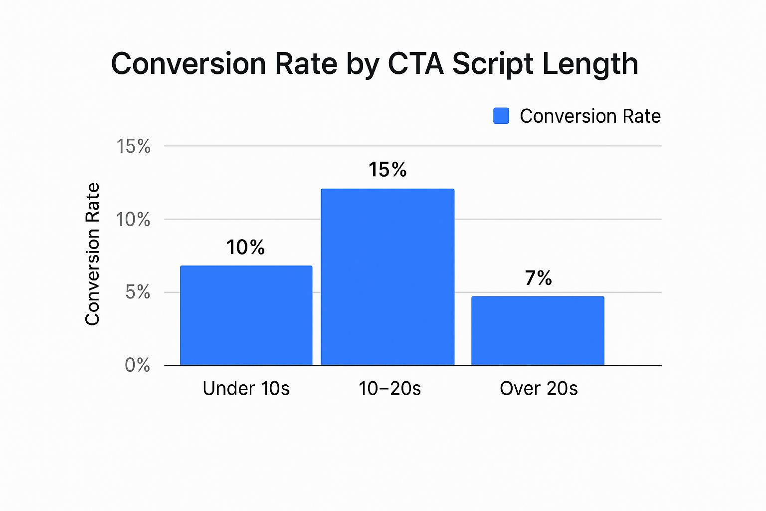
As you can see, the data points to a clear sweet spot. CTAs that run between 10 and 20 seconds seem to hit that perfect balance of giving enough context to be persuasive without overstaying their welcome.
Putting Your Video CTA into Action with Interactive Tools

Designing and timing your CTA is one thing, but making it real is where the rubber meets the road. Thankfully, you don't need to be a developer to make it happen. This is where interactive video platforms like VideoQi come in, turning your strategic vision into a clickable, functional reality.
The whole process is surprisingly straightforward. You start by uploading your final video file. Once it's in the system, you'll work within an editor that feels a lot like your standard video editing software, but with a powerful layer of interactive options. This is your canvas for placing the perfect video call to action.
Choosing the Right Type of Interactive CTA
This is the fun part-deciding exactly how you want your viewer to take action. You're not just stuck with a simple button anymore. Modern platforms give you a whole toolbox of CTA formats, each designed for different goals.
Here are a few of the most effective interactive elements I've seen work well:
- Clickable Buttons: The classic for a reason. They’re direct, universally understood, and perfect for actions like "Shop Now," "Download the Guide," or "Book a Demo."
- In-Video Forms: An absolute game-changer for lead generation. Instead of kicking viewers over to a separate landing page, you can capture their name and email right inside the video player. This slashes friction and can boost your submission rates in a big way.
- Clickable Hotspots: Think of these as invisible, clickable zones you can place over anything in your video-a product, a person, you name it. For an e-commerce brand, you could place a hotspot over a specific shirt in a lookbook video, linking it directly to the product page.
- Product Feeds: Some tools let you integrate a full product catalog right into the video. This creates a true "shoppable video" experience, allowing viewers to browse and add items to their cart without ever hitting pause.
A study by Grow & Convert found that welcome gates-a type of immediate, on-page CTA-have an estimated conversion rate of 10-25%. While this isn't a direct video metric, it proves a powerful point: a clear, can't-miss offer works. In-video forms and pop-up buttons are built on this very same principle.
Fine-Tuning Your CTA in the Editor
Once you’ve picked your CTA format, the real magic happens in the editor. You can literally drag and drop your chosen element onto the video timeline, setting the exact moment it appears and disappears.
Want your "Download Now" button to pop up precisely at the 1:15 mark, right after you've made your big pitch? You can set that in a few clicks.
From there, you dial in the details:
- Set the Destination: Just paste in the URL where you want the click to go. This could be a product page, a Calendly link, or a dedicated landing page.
- Customize the Look: Tweak the button’s color, text, and size to match your branding. The goal is for it to stand out just enough against the video background without being distracting.
- Configure the Behavior: You can decide if the video should pause when the CTA appears (to demand attention) or if the CTA should fade away after a few seconds.
This level of hands-on control makes sure your video call to action feels like a natural part of the experience, not a tacked-on annoyance.
If you’re ready for a deeper look at the nuts and bolts, our guide on how to make interactive video breaks down the technical side even further. With these tools at your disposal, you can finally implement, test, and refine your CTAs to drive real, measurable results.
How to Measure and Optimize Your CTA Performance
https://www.youtube.com/embed/kKLHEnuS__0
So, you’ve launched your video with a brand new call to action. Great! But the work doesn't stop there. In fact, it’s just beginning. The real magic happens when you start digging into the data to see how people are actually interacting with your CTA.
Without solid data, you're essentially flying blind. You have to move past simple view counts and get to the metrics that show you what’s working, what isn’t, and why. Only then can you make smart tweaks that get real results.
Key Metrics That Actually Matter
When it comes to your video CTA's performance, a few specific metrics tell the most important part of the story. These are the numbers that connect your video directly to your business goals.
Here’s what I always focus on:
- Click-Through Rate (CTR): This is the big one. It's the percentage of viewers who saw your CTA and actually clicked it. A high CTR is a fantastic sign that your message, design, and timing are all hitting the mark.
- Conversion Rate: This takes it a step further. It measures the percentage of people who clicked and then completed the action you wanted-like signing up, downloading a file, or making a purchase. Ultimately, a great video CTA is designed to improve sales conversion rates.
- Engagement Heatmaps: I love these. Tools like VideoQi provide visual heatmaps that show you exactly where viewers are clicking and re-watching. It’s the quickest way to see if your CTA button is getting noticed or if it’s lost in the background.
These metrics give you a clear window into how your audience behaves. If you want to go even deeper, our complete guide to video marketing analytics is a great resource for mastering your data.
Turning Insights into Action
Your analytics dashboard is where the rubber meets the road. It helps you spot crucial patterns. For example, are you seeing a huge drop-off right before your CTA appears? That’s a classic sign that your video might be dragging on too long or that you’ve waited too late to present your offer.
The data backs this up. Product demo videos are incredibly effective, convincing around 87% of viewers to buy a product. For marketers, engagement is king, with 66% pointing to it as a top indicator of success. This just goes to show how powerful a well-placed CTA can be.
My best advice? Don't be afraid to experiment. A/B testing is your secret weapon. Try changing the button color. Test different copy. See what happens if you show the CTA 10 seconds earlier. You'd be surprised how a tiny tweak can create a massive lift in performance.
By constantly keeping an eye on these metrics and making changes based on what you learn, you turn your video strategy from guesswork into a reliable, performance-driving engine. This cycle of measuring, analyzing, and optimizing is how you truly prove your ROI and build a library of content that consistently converts.
Answering Your Top Questions About Video CTAs
Even after mapping out a great strategy, a few practical questions always pop up when you start getting your hands dirty. A powerful video call to action can feel like a secret weapon, but it's totally normal to have some last-minute uncertainties before you're ready to go live.
We've been there. So, we've pulled together the most common questions we hear from marketers and business owners. Let's get these answered so you can start putting your videos to work.
What's the Best Type of Video CTA to Use?
This is the big one, but the answer isn't a one-size-fits-all solution. The "best" CTA is always the one that aligns perfectly with your goal for that specific video. It's about making the viewer's next step obvious and effortless.
My advice? Always work backward from your objective.
- Looking for leads? Nothing beats an in-video form for capturing an email address. It removes the friction of sending someone to a separate landing page, which can be a huge drop-off point.
- Driving e-commerce sales? A clickable "Shop Now" or "Add to Cart" button that leads straight to the product page is your best bet. It closes the gap between interest and purchase.
- Building an audience? Simple, direct buttons like "Subscribe" or "Download the Guide" work wonders for growing your community or offering more value.
The real magic happens when the action you're asking for feels like the natural next step for the viewer.
Can I Add Clickable CTAs to My YouTube Videos?
This is a frequent source of confusion, and the answer is yes and no. YouTube allows for some interactivity through its Cards and End Screens, which let you link out to approved destinations like your website or a merch store.
However, you cannot embed fully custom, interactive elements-like email capture forms, "choose your adventure" paths, or uniquely designed buttons-directly inside the YouTube player.
For that level of control, you'll need to host your video on an interactive video platform like VideoQi. From there, you can embed the fully interactive video on your website or landing pages.
Think of it this way: YouTube is fantastic for building awareness and reach. Your website, powered by an interactive video tool, is where you drive deep engagement and conversions.
How Many CTAs Should I Put in a Single Video?
When it comes to CTAs, less is almost always more. I've seen it time and again: giving a viewer too many options leads to "decision paralysis." They get overwhelmed and simply click away without doing anything. It’s a classic conversion killer.
As a rule of thumb, stick to one primary call to action per video. This singular focus gives your audience a clear, simple path to follow.
If you absolutely must include a secondary, less critical CTA (like a "Subscribe" button next to a primary "Book a Demo" button), make sure your main CTA is visually dominant. The goal is always clarity over clutter.


