
Discover key content performance metrics that unlock ROI, audience insights, and growth. Learn how to track what truly impacts results.
Think of content performance metrics as the vital signs for your marketing efforts. They are the specific, measurable data points that tell you exactly how your audience is interacting with the content you create. In essence, these metrics bridge the gap between your creative work and tangible business outcomes, showing you what’s hitting the mark and what’s falling flat.
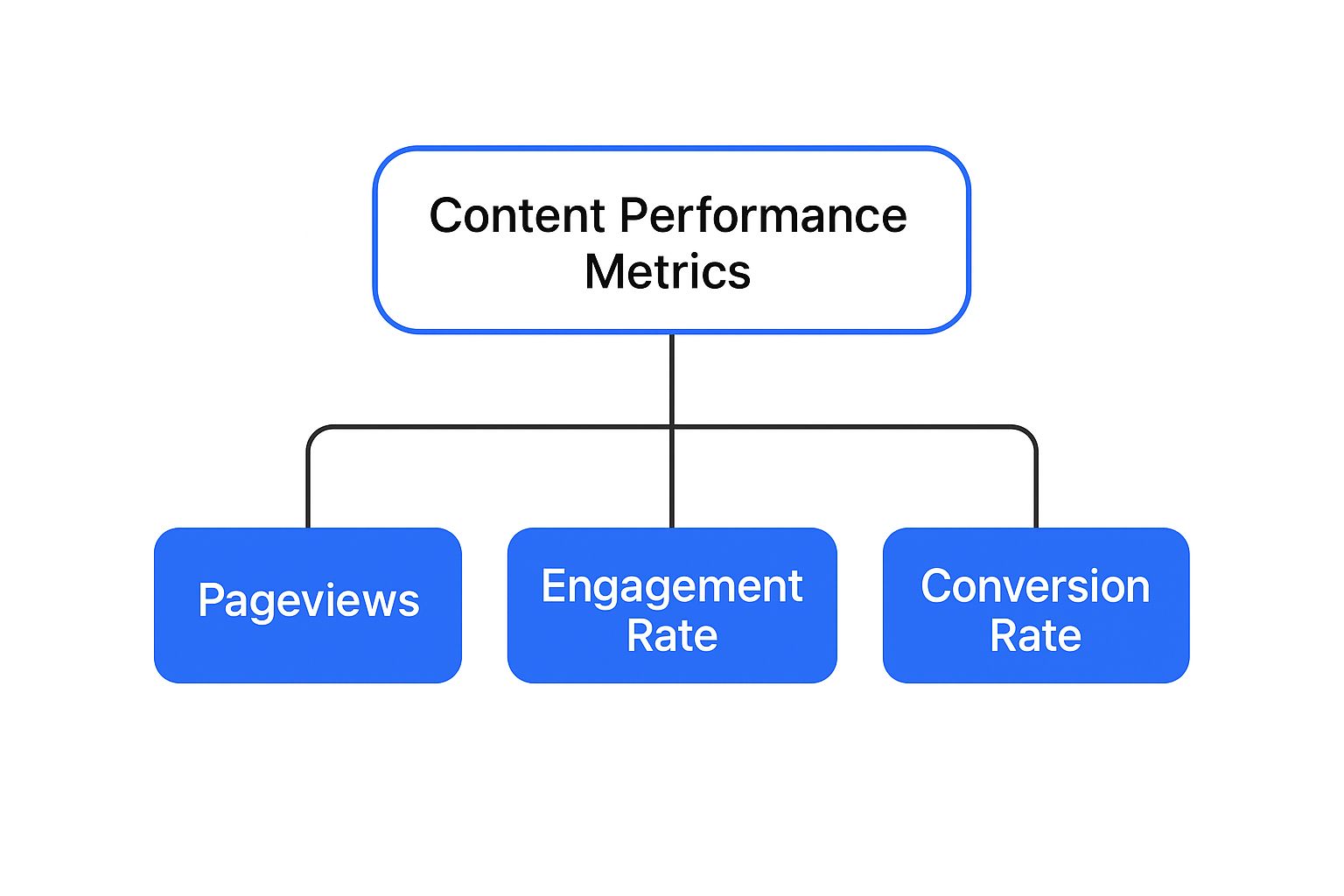
What Your Content Metrics Are Really Telling You
Publishing content without tracking its performance is like a stand-up comedian telling jokes to an empty room. You’re putting material out there, but you have no idea if anyone is laughing, listening, or even present. You're just guessing.
To make your marketing truly effective, you need to go beyond just hitting "publish." This is where content performance metrics become your most trusted guide. They provide the crucial feedback loop that reveals the entire story of how your audience finds, consumes, and responds to your work.
To get started, it's helpful to group these metrics into a few key categories. Each one answers a different but equally important question about your business and your audience.
Here’s a quick breakdown of the main types of metrics you'll encounter:
| Metric Category | What It Measures | Key Business Question |
|---|---|---|
| Reach & Awareness | The size of the audience your content is exposed to. | "Are we reaching enough of the right people?" |
| Engagement | How your audience actively interacts with your content. | "Is our message resonating and holding their attention?" |
| Conversion | The specific actions users take after consuming your content. | "Is our content driving valuable business results?" |
| Revenue | The direct financial impact of your content efforts. | "Is our content generating a positive return on investment?" |
This framework helps you move from just collecting data to asking the right questions, turning numbers into a clear strategic roadmap.
Going Deeper Than "Vanity" Stats
It’s tempting to get excited by big numbers like total page views. While seeing a spike in traffic feels great, it's what we call a "vanity metric"-it looks good on the surface but doesn't tell you the whole story. Are those thousands of visitors actually reading what you wrote? Do they care about your message? Are they taking the next step you want them to take?
To get a real sense of performance, you need to connect the dots. This infographic does a great job of showing how different metrics build on each other, moving from initial awareness to the actions that truly matter.
As the visual shows, success isn't defined by a single number. It’s a journey from capturing attention to inspiring action.
By analyzing the right mix of metrics, you stop just counting eyeballs and start truly understanding your audience's behavior. This is the key to making smart, data-informed decisions that not only justify your marketing spend but also prove its ROI. It’s the difference between guessing and knowing.
Ultimately, every single metric tells one part of a much larger story. For example, a high bounce rate could be screaming that your page loads too slowly or the content doesn't match the headline's promise. On the flip side, a high number of downloads on a specific guide tells you you've struck gold with a topic your audience craves.
Learning to read these signals is how you refine your strategy, create more of what works, and build a powerful content engine that delivers real results.
Decoding Your Audience Reach and Traffic

Before we can even think about engagement or conversions, we have to ask a much more fundamental question: Is anyone actually seeing our content? This is the ground floor of content analytics, the first and most basic health check of your content's visibility.
Think of it like a movie's opening weekend. The box office numbers don't tell you if people liked the film, but they do tell you how many people bought a ticket to see it in the first place.
The most straightforward metric here is Page Views, which is a simple tally of every time a page on your site is loaded. It’s a good, broad measure of traffic volume, but it’s best used with other data to get the full story. For a deeper dive, you can learn more about how page views fit into a complete analytics strategy.
The thing is, page views alone can be a bit misleading. They don't differentiate between one superfan visiting your site 100 times and 100 different people visiting once. That's where Unique Page Views (often called Unique Visitors) comes into play. This metric filters out all those repeat visits from the same person within a certain timeframe, giving you a much truer sense of your actual audience size-the number of individual humans you're reaching.
Where Your Visitors Come From
Knowing how many people show up is one thing, but understanding how they found you is just as crucial. Your traffic sources are the digital roads and pathways that lead people to your content. Analyzing them shows you which of your distribution channels are really pulling their weight. It's like asking your entire audience, "So, how did you hear about us?"
Your traffic is typically broken down into a few main categories:
- Organic Search: These are visitors who found you after a search on a platform like Google. Strong organic traffic is a fantastic sign that your SEO is working and your content is genuinely answering people's questions.
- Direct Traffic: This is your core audience-people who type your website address directly into their browser or use a bookmark. They already know who you are and are coming back for more.
- Referral Traffic: These visitors clicked a link on another website to get to yours. This is a great indicator that your content is seen as valuable and authoritative enough for others to cite.
- Social Media: This bucket includes anyone who arrived from platforms like LinkedIn, X (formerly Twitter), or Facebook. It's a direct measure of how well your social media promotion is working.
When you look at these sources, you start to see which of your efforts are actually moving the needle. A sudden spike in referral traffic? That's your cue to dig in, find out which sites are sending people your way, and maybe even build a stronger relationship with them.
Tracking these initial content performance metrics isn't just a numbers game. It's about uncovering the story of how people discover you. High page views from organic search tells a completely different story than high direct traffic.
Interpreting Early Traffic Signals
At this stage, you're essentially checking your content's "curb appeal." Metrics like Entrances show you which pages are the most common starting points for a user's session, highlighting your primary digital front doors.
On the flip side, a metric like Exits Per Page View shows the percentage of people who left your site from a particular page. A high exit rate could be a warning sign, suggesting the page isn't compelling enough. Or… it could mean the visitor found exactly what they were looking for and left satisfied. Context is everything.
These top-of-funnel metrics don't give you all the answers, but they help you ask the right questions. They set the stage for a much deeper dive into what people actually do once they've arrived.
Gauging Real Audience Engagement
Traffic numbers can tell you who showed up to the party, but engagement metrics tell you who actually stayed to dance. Views are just a starting point; genuine, focused attention is the real prize. This is where we look past simple counts and start measuring the heartbeat of your content-the active interaction that signals a true connection with your audience.
Think of it like this: a high number of visitors to your article is like a crowded bookstore. It certainly looks impressive, but what really matters is how many people are actually pulling a book off the shelf, sitting down, and getting lost in its pages. The most important content performance metrics for engagement measure precisely that level of interest.
Beyond the Clock: Time on Page
One of the first places people look is Average Time on Page. It tracks how long, on average, a visitor hangs around on a specific piece of content. Logically, a longer duration often suggests the content is compelling, valuable, and holding the reader's attention.
But context is everything. A low time on page isn't automatically a sign of failure. If someone was searching for a quick answer-like a specific stat or a phone number-finding it instantly and leaving is a success! In that case, your content did its job perfectly.
On the flip side, a high time on page for a very short article might actually indicate confusion, not engagement. The user could be re-reading sections because the information is unclear or poorly structured.
The goal isn't just to make people stay longer; it's to understand why they stay or leave. Interpreting time-based metrics requires looking at the content's format and objective to understand the story behind the number.
This same logic applies to Bounce Rate-the percentage of visitors who land on a page and leave without clicking anywhere else on your site. A high bounce rate on a blog post can be perfectly fine; the reader got their answer and left satisfied. A high bounce rate on your homepage, however, is a major red flag.
Measuring Active Attention
To get a clearer picture of real interaction, we need to look at metrics that track active participation. These tell us that your audience isn't just passively letting the page sit open in a browser tab, but are actively consuming what you've created.
Here are the key active engagement metrics to watch:
- Scroll Depth: This tracks how far down the page a user actually scrolls. Hitting a 75% scroll depth is a strong signal that your content was engaging enough to keep them reading well past the introduction.
- Social Shares: When someone shares your content on their own social channels, it's a powerful endorsement. It means they found it so valuable they were willing to stake their own reputation on it.
- Comments: While not every post will spark a lively debate, comments show a highly engaged audience. These are people who feel connected enough to join the conversation.
- Video Plays and Watch Time: For any embedded videos, tracking how many people hit play and how long they stick around is crucial. To really dive deep, it's smart to explore specialized insights on video marketing analytics.
Analyzing historical data on these engagement points gives you incredibly valuable long-term insights. For example, tracking metrics like total engaged minutes and average engaged time daily helps you measure audience interaction beyond temporary traffic spikes. This is a key factor in building a loyal, returning audience. You can discover more about using historical dashboards to see how these trends develop over time.
This dashboard, for instance, shows how you can track engaged time to spot performance patterns.
A visual like this reveals trends that a single day's data would completely miss, highlighting which days or topics consistently capture and hold your readers' attention.
By focusing on these deeper metrics, you shift from measuring momentary exposure to understanding sustained interest. This is how you pinpoint your best-performing content and learn what truly resonates, turning passive visitors into a dedicated community.
Connecting Content to Business Results

Let's be honest. While traffic and engagement metrics paint a nice picture of audience interest, they don't actually put money in the company bank account. This is where your content has to prove its real worth by connecting directly to tangible business outcomes. We need to shift our focus from "Did they like it?" to the all-important question: "Did they take action?"
This is the bridge between marketing effort and financial return, and it's built by tracking conversion-focused content performance metrics. These are the numbers that show how your articles, videos, and guides contribute to the bottom line. Think of it as moving from getting applause to getting a signed contract; one feels good, but the other grows the business.
Measuring What Moves the Needle
The most direct way to measure your content's impact is through its Conversion Rate. At its core, this is simply the percentage of visitors who complete a specific, desired action after engaging with your content. It’s the ultimate report card on your content’s persuasive power.
Now, what counts as a "conversion" can be different for every business. If you're running an e-commerce store, it’s a sale. For a B2B company, it might be an action taken much earlier in the customer journey.
Key conversion actions you should be tracking include:
- Form Submissions: A visitor fills out a contact form to ask a question.
- Newsletter Sign-ups: A reader gives you their email, becoming a warm lead.
- Demo Requests: A prospect asks for a personalized walkthrough of your product.
- Gated Content Downloads: A user trades their contact info for a valuable ebook or whitepaper.
Each of these actions is a clear signal of intent. They mark the moment a passive reader becomes an active participant in your sales funnel, creating a direct link between the content they just consumed and the lead they just became. This is your first solid step in proving ROI.
Attribution is the key that unlocks the connection between content and conversions. It's the detective work of figuring out which specific piece of content gets the credit for a user's action. Without it, you're just flying blind, unable to prove which of your efforts are actually paying off.
From Leads to Revenue
Once you start generating leads, the next logical question is, "What did it cost us to get them?" This is where Cost Per Acquisition (CPA) becomes an indispensable metric. It tells you exactly how much you spend, on average, to win a new customer from a specific piece of content or campaign.
Calculating your CPA is straightforward: just divide the total cost of your content campaign by the number of conversions it produced. This metric is a powerful lens for judging efficiency. A low CPA means your content is a lean, mean, business-generating machine.
Of course, the ultimate goal isn't just leads-it's paying customers. Tracking the number of New Customers who first converted on a specific piece of content provides undeniable proof of its value. When you can walk up to a stakeholder and show that a single blog post brought in 10 new clients, the entire conversation about your content's importance changes.
Setting Up for Success with Analytics Goals
To track these critical actions, you absolutely must set up goals within your analytics platform, like Google Analytics. This involves telling the system what specific user actions you consider a conversion.
For instance, you can create a goal that triggers every time a visitor lands on your "thank you" page after submitting a form. By doing this, you can directly attribute that submission back to the specific blog post or landing page the user was on right before they converted.
This setup isn't optional for anyone serious about measuring results. It’s what allows you to build a powerful, data-backed case for your content strategy and show leadership exactly how your work fuels growth. For certain formats, like video, which has its own unique engagement patterns, you may want to dig deeper into tracking specific video engagement metrics to get the full picture.
By connecting these dots, you transform your content from a simple communication tool into a predictable, measurable driver of business success. You’ll finally be able to confidently answer the question, "What did we get from that investment?"
Alright, let's take a look under the hood. So far, we've been talking about what happens after you’ve published your content. But let's be honest, a lot of what makes content successful is baked in long before anyone ever sees it. If your creation process feels like wading through mud, you'll never be able to produce enough high-quality work to compete, no matter how brilliant your ideas are.
This is where we pivot from the metrics your audience sees to the ones that measure how your team actually works.
Think of your content team as a production line. A well-oiled machine. It needs to be efficient and reliable, capable of putting out great work consistently. The metrics that track this efficiency are just as critical to your long-term success as page views or conversions.
Measuring Your Output and Speed
When it comes to your internal process, two key metrics really tell the story: Content Velocity and Time to Publish. Together, they give you a brutally honest look at your team's capacity and whether your workflow is helping or hurting.
-
Content Velocity: This is a fancy term for a simple idea: How much content are you actually creating in a given period? A week, a month, a quarter-you pick. It’s the first step to setting realistic goals and understanding what your team can truly handle without burning out.
-
Time to Publish: This one tracks the clock. It’s the average time it takes for an idea to go from a brainstorm session to a live, published piece. A long Time to Publish is a huge red flag. It often points to hidden bottlenecks, like a painfully slow review process, technical holdups, or just not having enough people to get the job done.
Paying attention to these two numbers helps you diagnose problems you might otherwise miss. For instance, is your content velocity low even though everyone feels swamped? Your Time to Publish is probably bloated by a clunky approval chain.
Let’s be clear: tracking these operational metrics isn't about forcing creativity or choosing quantity over quality. Think of them as diagnostic tools. They help you build a smarter, more sustainable system that empowers your team to do their best work without all the friction. The goal is to remove roadblocks, not to cut corners.
Balancing Quality with Scalability
The real sweet spot is finding that perfect harmony between producing enough content to stay relevant and maintaining the quality that actually gets results. A faster production engine is useless if it’s churning out junk. On the flip side, a perfectionist engine that only produces one flawless article a year is just as ineffective.
This balancing act has gotten a lot more interesting lately. AI-assisted creation tools have completely changed the game in terms of speed. We're seeing teams go from publishing an average of 4 articles per month to over 25 by integrating AI into their workflows. That's a staggering 525% increase in output. More content means more chances to connect with your audience and drive revenue. If you're curious, you can learn more about how teams are boosting production with AI tools on Zimmax.
Streamlining your process lets you scale up without sacrificing the quality that earned you an audience in the first place. Faster output can mean more A/B tests, more SEO swings, and a bigger slice of your audience’s attention. But-and this is a big but-you have to make sure this increased volume doesn't result in shallow, generic content that hurts your brand and sends your bounce rate through the roof. If that’s a concern, we have a whole guide on how to reduce bounce rate that can help.
When you optimize your content engine, you’re building a system where great work can be produced efficiently and at scale. This frees up your team to spend less time fighting the process and more time on what really matters: strategy and creativity.
Building Your Actionable Performance Dashboard

Tracking individual content metrics is a great start, but looking at them one by one feels like trying to understand a puzzle by staring at a single piece. You can see the color and the shape, but you have no idea how it fits into the bigger picture. To truly see what's going on, you need to assemble all those pieces in one place. That's exactly what a performance dashboard does-it transforms a pile of raw data into a clear story about what’s working, what isn't, and why.
Think of it as the mission control for your entire content operation. Instead of bouncing between different analytics platforms for traffic, engagement, and conversion data, a well-built dashboard brings everything together. It becomes the single source of truth that gets your whole team, from writers to the CMO, aligned on the same goals and results.
Designing a Story-Driven Dashboard
A great dashboard does more than just show you numbers; it tells you a story about your progress. The most intuitive way to build this narrative is to structure your dashboard around the marketing funnel. This approach creates a logical flow, guiding you from the first moment someone discovers your brand all the way down to the actions that actually drive revenue.
Here’s a simple way to frame it:
- Awareness Metrics: At the very top, you want to see how far your content is reaching. This is where you track Page Views, Unique Visitors, and where that traffic is coming from (Traffic by Source).
- Engagement Metrics: Once you have their attention, are you keeping it? This middle section is all about engagement. Focus on metrics like Average Time on Page, Scroll Depth, and Social Shares.
- Conversion Metrics: This is the bottom line-where your content proves its business value. Here, you'll want to spotlight your Conversion Rate, the number of Leads Generated, and how many New Customers came from specific content.
When you lay out your dashboard this way, you can spot bottlenecks in your funnel almost instantly. Seeing high awareness but dismal engagement? That might be a sign your headlines are fantastic but the content itself isn't delivering on its promise.
Your dashboard should never be a one-size-fits-all report. It’s a flexible tool that needs to be tailored to whoever is looking at it. What a content creator needs to see is completely different from what a CMO cares about.
A writer, for example, might obsess over the Time on Page and Scroll Depth for a single article they wrote. The CMO, on the other hand, is going to be far more interested in the big-picture outcomes, like the overall Lead Generation and the campaign's Cost Per Acquisition.
Bringing Your Dashboard to Life
You don't need a data science degree to build a killer dashboard. Tools like Google Analytics and Looker Studio (which used to be Google Data Studio) make creating visual, interactive reports surprisingly simple. Looker Studio is particularly great because it can pull data from multiple sources, like your Google Analytics and Google Sheets, and merge them into one clean, shareable dashboard.
As you build, prioritize clarity over complexity. Simple charts and smart color-coding go a long way in making trends pop. A pie chart is perfect for showing the breakdown of your traffic sources, while a line graph is the best way to visualize how your Page Views have changed over time.
To make your dashboard truly actionable, the key is to organize it around your specific strategic goals. The table below shows how you can prioritize different metrics depending on what you’re trying to accomplish.
Essential Dashboard Metrics by Goal
| Strategic Goal | Primary Metrics to Track | Secondary Metrics to Track |
|---|---|---|
| Increase Brand Awareness | Unique Visitors, Organic Traffic, Social Shares | Page Views, Entrances |
| Boost Audience Engagement | Avg. Time on Page, Scroll Depth, Comments | Bounce Rate, Pages per Session |
| Generate More Leads | Conversion Rate, Form Submissions, New Contacts | Cost Per Acquisition (CPA) |
Taking this kind of goal-oriented approach transforms your dashboard from a static report into a dynamic tool for making decisions. It gives everyone on your team the power to see their impact and make smarter choices that move the needle.
Answering Your Toughest Content Metrics Questions
Once you've got the basics down, you'll start running into those tricky, real-world questions that pop up when you're actually in the weeds with your data. This is where the rubber meets the road, and learning how to navigate these nuances is what really separates good analysis from great strategy.
Let's dig into a few of the most common hurdles I see content pros encounter.
How Do I Know Which Metrics Actually Matter?
It's a classic mistake: trying to measure every piece of content with the same yardstick. The truth is, your metrics should always ladder up to the goal of that specific piece of content. You wouldn't expect a top-of-funnel blog post to drive sales directly, just like you wouldn't judge a fish on its ability to climb a tree.
Think of it in terms of the customer journey:
- Awareness Content (like blog posts or infographics): Your goal is to get on people's radar. Focus on metrics that show reach and attention, like Page Views, Unique Visitors, Organic Traffic, and Time on Page. You're just trying to get a foot in the door.
- Consideration Content (like case studies or webinars): Here, you're trying to build trust and encourage a deeper look. You'll want to track things like Form Submissions, Download Rates, Scroll Depth, and Video Watch Time. These tell you someone is seriously kicking the tires.
- Decision Content (like pricing pages or product demos): This is the finish line. The metrics that matter most are the ones tied to action: Conversion Rate, Demo Requests, and, of course, New Customers.
What if My Data Seems Contradictory?
Ever see a page with a crazy-high bounce rate but also a really long time on page? It happens all the time. Your first instinct might be to panic, but these numbers aren't necessarily a contradiction-they're just telling a more complex story.
A high bounce rate isn't always a bad sign. If someone lands on your blog post, finds the exact answer they needed in two minutes, and then leaves, your content did its job perfectly. That's a win, not a failure. Context is king.
Always dig for the "why" behind the what. A high exit rate on your "Thank You" page after a form submission is perfectly normal. A high exit rate on the second step of your checkout process is a full-blown emergency. You have to connect the dots between different metrics to see the whole story before you start making changes.
How Do I Talk About This Stuff to My Boss (or Non-Marketers)?
When you're sharing your results with executives or colleagues from other departments, leave the marketing-speak at the door. They don't care about the textbook definition of "bounce rate." They care about what it means for the business.
Your job is to translate your data into the language they speak: customers, costs, and revenue.
So, instead of saying, "Our organic traffic is up by 20%," try this: "We got our message in front of 5,000 more potential customers this month, all without spending a dime on ads."
See the difference? Frame the data as a story about business growth, efficiency, and ROI. Use clear visuals, keep it simple, and always tie your numbers back to the bottom line. That's a language everyone understands.
Turn your viewers into active participants and see your conversions climb. With VideoQi, you can embed clickable calls-to-action, quizzes, and personalized paths directly into your videos. Discover how to transform passive watching into measurable results.


