
Discover how to improve website conversions with actionable strategies. Learn to analyze user behavior, enhance UX, and A/B test for measurable results.
Before you touch a single line of code or change a button color, you need to know exactly what you’re working with. Trying to improve your website's conversions without a deep dive into your analytics is like a doctor prescribing treatment without a diagnosis. You’re just guessing. The real starting point is getting your analytics set up to tell you the story of what your visitors are actually doing.
This whole process kicks off with a simple but critical question: What does a "conversion" even mean for your business? It's not always about making a sale right then and there. A conversion is any action you want a visitor to take.
Think about it. It could be someone:
- Signing up for your email newsletter
- Requesting a demo of your software
- Downloading an important resource like a whitepaper or case study
- Adding a product to their cart
- Filling out a contact form
Once you've nailed down your primary and secondary goals, you can set them up in your analytics tool, like Google Analytics. This is what allows you to measure how effectively your site is funneling people toward those valuable actions. Without this clarity, you’re flying blind. You can't tell the difference between a busy website and a productive one.
Identifying Your Key Performance Indicators
With your goals locked in, it’s time to pick the Key Performance Indicators (KPIs) that directly measure your progress toward them. Don't get overwhelmed by the mountain of data available. The trick is to focus on the handful of metrics that truly matter.
For an eCommerce shop, this usually means keeping a close eye on:
- Cart Abandonment Rate: What percentage of shoppers add items to their cart but bail before buying? This is a goldmine for insights.
- Average Order Value (AOV): How much does the average customer spend in a single transaction?
- Checkout Completion Rate: Of the people who start the checkout process, how many actually finish?
A B2B SaaS company will have a different dashboard. Their critical numbers might be:
- Lead-to-Demo Rate: What percentage of new leads end up scheduling a demo with your sales team?
- Pricing Page Bounce Rate: How many people hit your pricing page and immediately leave? It's a huge red flag.
- Free Trial Sign-ups: The raw number of users who are willing to give your product a try.
Your KPIs are your North Star. They guide every decision you make. A high bounce rate on a critical landing page or a massive drop-off at checkout aren’t just abstract numbers-they’re flashing signs pointing to specific problems you need to solve.
This is all about focusing your efforts where they'll have the most impact. As the image below shows, targeted optimizations rooted in data always beat random, hopeful changes.
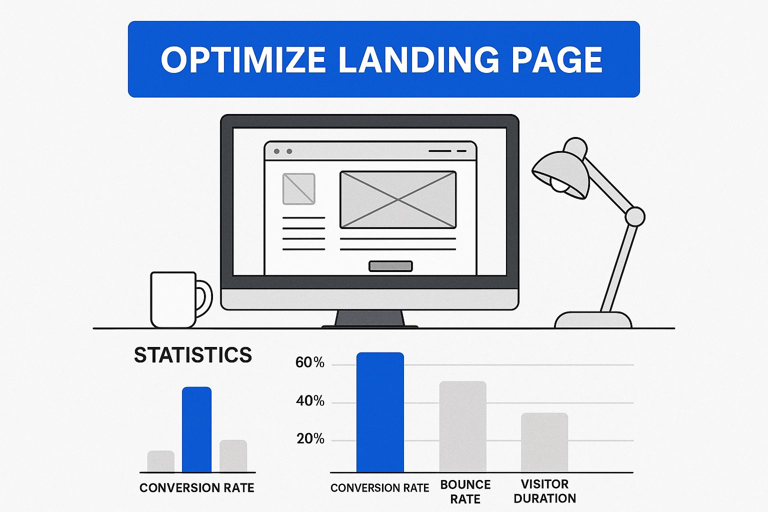
It’s a simple concept: know your numbers, find the weak spots, and fix them. That's how you get real results.
Understanding Industry Benchmarks
Looking at your own data is non-negotiable, but it’s always smart to peek over the fence and see how you compare to others in your field. This context helps you set realistic goals and understand what’s possible.
Below is a table showing some typical conversion rates across various industries. Use it to get a rough idea of where you stand, but remember that these are just averages.
Typical Conversion Benchmarks by Industry
| Industry | Average Conversion Rate (%) |
|---|---|
| E-commerce | 2.5 – 3.0% |
| B2B SaaS | 1.5 – 2.5% |
| Finance & Insurance | 5.0 – 7.0% |
| Travel & Hospitality | 3.5 – 4.5% |
| Health & Wellness | 2.0 – 3.5% |
| Education | 4.0 – 6.0% |
Source: Data compiled from various industry reports and marketing analytics studies.
For example, the general average eCommerce conversion rate is a key benchmark, often floating between 2.5% and 3%. However, it's not a one-size-fits-all number. A deep dive from Shopify reveals their stores average closer to 1.4%, with only the top 10% hitting impressive rates like 4.7%. You can explore a more detailed analysis of these eCommerce benchmarks to see the full picture.
Knowing these figures helps you ground your ambitions in reality. This foundational analysis ensures that every single tweak and test you run is an informed decision, all part of a systematic plan to improve your website's conversions.
Optimizing Your Highest Impact Traffic Channels
Not all traffic is created equal. That sounds obvious, but you’d be surprised how many websites treat every visitor exactly the same. Someone who clicks a hyper-specific Google Ad is in a completely different headspace than a person casually scrolling through their Instagram feed.
If you really want to move the needle on conversions, you have to stop this one-size-fits-all approach. It all starts with figuring out which channels are sending you not just the most visitors, but the right visitors-the ones with real conversion potential. Once you know where they're coming from, you can craft a much smoother, more persuasive journey from their first click to the final sale.
Aligning Ad Copy and Landing Pages
One of the quickest ways to burn through your ad budget is having a jarring disconnect between your ad and your landing page. We’ve all been there. You click an ad that promises "50% Off Your First Custom Coffee Box," only to be dumped on a generic homepage with no mention of the deal. It’s confusing, frustrating, and a guaranteed way to lose a potential customer.
That jarring experience kills conversions and wastes your money. The secret is something we call message match. Your landing page headline has to instantly reflect the promise made in your ad, and the look and feel should be consistent, too.
- For PPC Ads: When someone frantically searches for "emergency plumbing services" and clicks your ad, they need immediate reassurance. Your landing page should scream, "You're in the right place!" with a bold headline like "24/7 Emergency Plumbing in Your Area."
- For Social Media Ads: If a visitor taps on an Instagram ad featuring a beautiful red dress, they should land directly on the product page for that exact dress. Don’t make them hunt for it on a category page with a hundred other options.
This seamless handoff builds instant trust and clears the path to conversion.
The core idea is simple: deliver exactly what you promised. When the user's expectation, set by the ad, is instantly met on the landing page, their confidence in your brand skyrockets, making them far more likely to convert.
Nurturing Different Visitor Mindsets
It’s not just about paid ads. Your organic channels need their own distinct strategies, too. You wouldn't talk to a loyal email subscriber the same way you’d greet a first-time visitor from a Google search, right? Your website shouldn't either.
Email Marketing Visitors
These people already know you and, more importantly, they like you. They’ve invited you into their inbox, which is a huge signal of trust.
- Your Strategy: Skip the basic brand intro. Landing pages for your email list can get straight to the point. Try using personalized greetings or referencing past purchases to make them feel like a VIP.
Organic Search Visitors
These folks are on a mission. They have a specific question or problem, and they’ve landed on your site hoping you have the answer.
- Your Strategy: Your content has to deliver on their search intent, and fast. If they searched for "how to choose a running shoe," your page needs to be the ultimate guide, packed with expert advice, maybe even a comparison tool, and clear CTAs that point to the right products. Your job is to prove your authority first, then guide them to a solution.
Understanding these nuances is a game-changer. The data backs this up, showing that conversion rates vary wildly by channel. While PPC campaigns might see a 1.5% conversion rate, SEO leads are stronger at 2.3%. Email marketing often does even better at 2.8%, and direct traffic-people who already know your brand well enough to type in your URL-can convert as high as 3.3%. You can dig deeper into these conversion benchmarks on firstpagesage.com.
By tailoring your approach to each channel, you meet visitors where they are. You’re speaking their language and guiding them down a path that feels natural and helpful, which is one of the most powerful ways to lift conversions across your entire site.
Enhancing User Experience to Drive Conversions
So, your analytics data tells you what people are doing on your site. But to really move the needle on conversions, you need to understand why they're doing it. This is where User Experience (UX) comes in.
Think of it this way: if your website is confusing, frustrating, or just feels a bit sketchy, you're killing your conversions before they even have a chance. It doesn't matter how great your traffic is. Improving your UX is all about smoothing out the rough spots and making it dead simple for a visitor to get what they came for.
Imagine walking into a store where the aisles are a mess and you can't find a price tag or a checkout counter. You’d walk right out, right? Your website is no different. Every single element, from your navigation menu to the fields on your checkout form, needs to be designed with the user's journey in mind. Once that path feels smooth and logical, conversions start to feel like a natural outcome.
Spotting Friction with a Heuristic Evaluation
You don't have to be a seasoned UX pro to spot the most obvious problems on your site. A great place to start is with a heuristic evaluation-which sounds complicated, but it's really just a fancy way of saying you review your site against a common-sense checklist of usability principles. It’s a fast-track method for putting yourself in your customer’s shoes.
Grab a coffee, open your site, and start asking yourself some tough questions as you click through your most important pages:
- Is the navigation actually clear? Can a first-time visitor find your products, pricing, and contact info without a scavenger hunt?
- Is the value proposition obvious? Can someone understand what you do and why it matters within five seconds of landing on your homepage?
- Are your forms a pain to fill out? Be honest. Are you asking for a phone number on a simple newsletter signup? That's a classic conversion killer.
- How does it look on a phone? With over 70% of eCommerce traffic now coming from mobile, a clunky mobile experience is inexcusable. Buttons need to be big enough to tap, and no one should have to pinch-and-zoom to read your text.
High bounce rates are often a direct result of poor usability. When people can't find what they need, they're gone. We dive deeper into this specific problem in our guide on how to reduce bounce rate.
A study of eCommerce businesses found that a website loading in one second has a conversion rate 2.5 times higher than a site that loads in five seconds. Friction isn't just about confusing design; it's also about speed.
Building Trust to Alleviate User Anxiety
Every time a user has to enter an email, fill out a form, or pull out their credit card, there's a flicker of doubt. Is this site legit? Is my data safe? What if I need to return this? Your job is to quiet that anxious inner voice.
This is where trust signals become your best friend. They are visual cues you strategically sprinkle throughout your site to reassure users and build their confidence, especially right before they make a big decision.
High-Impact Trust Signals You Can Use
| Trust Signal Type | Example | Best Placement |
|---|---|---|
| Social Proof | Customer reviews and star ratings | Directly on product pages, near "Add to Cart" buttons. |
| Security Badges | SSL certificate logos (e.g., "Secure Checkout") | Throughout the checkout, especially near payment fields. |
| Authority Proof | "As seen in" logos from well-known media outlets | On the homepage or dedicated landing pages. |
| Clear Policies | Easy-to-find links to return & shipping policies | In the website footer and on product pages. |
Here’s a real-world example I see work all the time: placing a "30-Day Money-Back Guarantee" badge right below your main call-to-action button. It’s a small addition, but it demolishes a huge psychological barrier for a hesitant buyer. Suddenly, the purchase feels a lot less risky.
These little enhancements work together to make the path to conversion feel not just easy, but safe.
How Page Speed Directly Impacts Your Conversion Rate
Every single millisecond counts. In a world of instant gratification, a slow-loading website is one of the fastest ways to lose a potential customer. I’ve seen it time and time again: businesses invest heavily in beautiful design and compelling copy, only to have it all undermined by sluggish performance.
Think of page speed not as a technical chore for your IT team, but as a core part of the user experience. It's the first impression you make. When a page lags, visitors don't just get impatient; they get suspicious. A slow site can feel unprofessional and untrustworthy, creating friction and doubt right when you need to be building confidence.
That brief delay is all it takes for them to second-guess their decision, check a competitor's site, or just give up and close the tab. That lost opportunity is a direct hit to your bottom line.
The Undeniable Link Between Speed and Sales
The connection between how fast your pages load and how many visitors convert isn't just a theory-it's backed by mountains of hard data. The impact is staggering.
A website that loads in one second can see conversion rates up to three times higher than a site that takes a sluggish five seconds to appear. That gap widens even more dramatically when you compare it to a site taking ten seconds. This isn't just a minor tweak; optimizing for speed is one of the highest-impact changes you can make.
Luckily, the web is getting faster. Today, about 86% of pages load in under five seconds, but that means user expectations are higher than ever. You can dig into more of these fascinating conversion rate optimization statistics on wordstream.com.
Diagnosing Your Website's Speed Issues
Before you can fix what's broken, you need to know what’s slowing you down. You don't have to be a developer to get started. Free tools like Google's PageSpeed Insights give you a detailed diagnostic report, pointing out exactly what’s causing the lag.
Just pop in your website's URL, and the tool will analyze its performance on both mobile and desktop. It provides an overall score and a breakdown of key metrics. Here’s what that report looks like in action.

The report gives you a clear, color-coded score and highlights specific opportunities for improvement, such as "Reduce initial server response time" or "Eliminate render-blocking resources." This is your action plan, handed to you on a silver platter.
Practical Fixes for a Faster Website
Once you have your report, it's time to roll up your sleeves and address the most common culprits. From my experience, many of the biggest speed killers can be tackled with some straightforward adjustments.
Here are a few high-impact fixes you can implement right away:
- Compress Your Images: This is the low-hanging fruit. Large, unoptimized images are often the single biggest cause of slow pages. Use a tool like TinyPNG to slash file sizes without wrecking visual quality.
- Leverage Browser Caching: This technique stores parts of your site (like your logo and stylesheets) on a visitor's browser. When they return, their browser doesn't have to reload everything, making their next visit feel almost instant.
- Use a Content Delivery Network (CDN): A CDN stores copies of your site on servers all over the world. When someone visits, content is delivered from the server closest to them, dramatically cutting load times, especially for a global audience.
- Minimize Clunky Code: Unnecessary code, plugins, and scripts can seriously bog down your site. Run an audit and get rid of anything you aren't actually using. I've often found that a single, poorly coded third-party plugin is the primary bottleneck.
- Optimize Videos: Massive video files can also bring your site to a crawl. Instead of hosting them yourself, embed them from services like YouTube or Vimeo. You might also consider interactive video platforms, which are often built for speed and engagement. We actually have some great video landing page examples that show how to do this effectively.
Pro Tip: Always focus on mobile performance first. Google uses mobile-first indexing, meaning it prioritizes the mobile version of your site for ranking. More importantly, your customers are on their phones, where a fast, seamless experience is even more critical.
Treating page speed as a continuous improvement project is the key. By regularly diagnosing issues and implementing these fixes, you create a smoother, more enjoyable journey for your visitors-and that’s a change that will show up directly in your conversion rate.
Making Data-Driven Decisions with A/B Testing
So, you’ve dug through your analytics and have a pretty good idea of where your user experience is falling short. That’s a huge first step. But even the best insights are, at the end of the day, just educated guesses. To really move the needle, you need to swap those guesses for hard evidence.
This is exactly where A/B testing comes in. It’s a straightforward method for pitting two versions of a webpage against each other-the original 'A' version and a new 'B' variation-to see which one performs better with your actual audience. It’s how you stop arguing about what might work and start proving what does.
Forming a Strong Hypothesis
A great A/B test never starts with a random thought like, "I wonder if a green button would work better." That's just throwing spaghetti at the wall. Real progress comes from a strong, data-backed hypothesis. All that hard work you just did digging into analytics and user behavior? That’s the fuel for your testing engine.
Let’s say your analytics reveal a massive drop-off on product pages, and when you watch session recordings, you see users hovering over the "Add to Cart" button without clicking. A solid hypothesis might sound like this: "By changing the CTA text from 'Add to Cart' to 'Buy Now & Get Free Shipping,' we can boost add-to-cart conversions because it clarifies the value and tackles shipping cost anxiety head-on."
That’s a killer hypothesis. It pinpoints a problem, suggests a specific solution, and predicts a measurable outcome.
Deciding What to Test for Maximum Impact
You can test almost anything on your site, but your time and traffic are finite resources. You have to be strategic. Forget about tiny tweaks to font sizes that no one will notice. You need to focus on changes with the potential for a real impact.
Start with the heavy hitters on your most critical pages-your homepage, product pages, and checkout flow.
| Element to Test | Example Variation (B) | Why It Matters |
|---|---|---|
| Headline | "Our CRM Software" vs. "Close More Deals in Half the Time" | Your headline is your first, best chance to communicate value. |
| Call-to-Action | "Sign Up" vs. "Start My Free 30-Day Trial" | This simple change can drastically reduce commitment friction. |
| Page Layout | Move testimonials above your list of features. | Using social proof early builds trust before you ask for the sale. |
| Media | Swap a static image for a short, interactive demo video. | Video engages people more deeply and can answer questions more effectively. |
Think small changes can't make a big difference? The grooming brand Live Bearded ran an A/B test where they simply added some trust-building icons and info to their slide-out cart. The result? A staggering 18% improvement in conversions. That’s the power of a targeted, hypothesis-driven test.
Running and Analyzing Your Tests
Once you launch your test, the hardest part is being patient. You have to let it run long enough to reach statistical significance-a fancy way of saying you have enough data to be sure the results aren't a fluke. Calling a test early because one version is pulling ahead is a rookie mistake that will lead you astray.
Not sure how long to run it? Use an online A/B test duration calculator. As a rule of thumb, letting a test run for at least one or two full business cycles helps smooth out any weird daily spikes or lulls in traffic.
The goal here is to build a culture of constant learning. Every single test, win or lose, teaches you something vital about your audience. A "losing" test isn't a failure; it’s a clear signal of what doesn't resonate, pointing you toward a better hypothesis for your next experiment.
This cycle of hypothesizing, testing, and learning is what fuels real, sustainable growth. If you’re looking for more ideas on where to start, check out our guide on conversion rate optimization tips you can put into action right away.
Answering Your Top Website Conversion Questions
Even with the best roadmap, you're bound to have questions. That's a good thing-it means you're paying attention to the details. The world of conversion optimization is always shifting, and the strategies that worked last year might need a fresh look today.
Let's dive into some of the most common questions we hear from businesses looking to turn more clicks into customers. This is your go-to resource for clearing up confusion and keeping your momentum strong.
What’s a Good Website Conversion Rate, Really?
This is the big one, isn't it? Everyone wants to know the magic number. But the honest answer is, it depends entirely on your context. You’ll often see reports quoting an average conversion rate around 2-3%, but treat that number as a general compass, not a definitive map.
What's considered "good" is a moving target that changes based on your industry, pricing, the quality of your traffic, and your business model. For example, a high-ticket B2B service will naturally have a lower conversion rate than a low-cost e-commerce product.
Your most important benchmark is your own past performance. The real win is achieving consistent, measurable growth.
A "good" conversion rate is one that's better than last month's. If you’re currently at 1%, aiming for 1.2% next quarter is a fantastic and realistic goal. Focus on beating your own numbers, not a generic industry average that might not even apply to you.
How Long Should I Let an A/B Test Run?
Patience is a virtue in A/B testing. Ending a test too early is one of the most common mistakes we see, often leading people to act on bad data. The right duration comes down to a balance between two key factors: your website traffic and how significant the change you're testing is.
A bustling e-commerce site might get statistically significant results in a week. A B2B website with less daily traffic might need to run the same test for three or four weeks to gather enough data for a confident decision.
As a rule of thumb, always run a test for at least one full business cycle-that's usually one or two full weeks. This helps smooth out anomalies in user behavior, like the difference between a curious weekday researcher and a ready-to-buy weekend shopper. Whatever you do, don't call the test the second one variation inches ahead. That’s a recipe for a false positive.
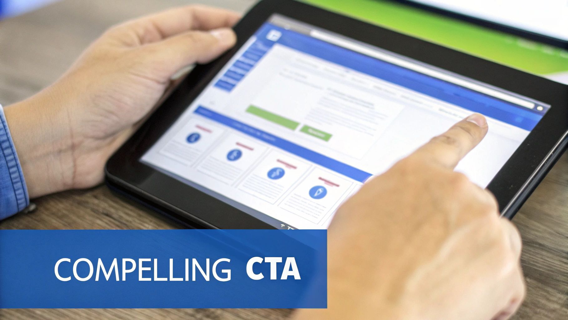
What’s the One Change That Has the Biggest Impact?
If I had to pick one area, it would be anything that sharpens your core value proposition and clarifies your call-to-action (CTA). These elements almost always produce the most significant results.
Put yourself in your visitor's shoes. The very first question they have is, "What's in it for me?" Your headline and opening sentence must answer that question immediately and convincingly. If that core message is fuzzy, nothing else you do on the page will matter.
Likewise, your main CTA button can be a goldmine for improvement. It needs to be unmissable, compelling, and focused on value. We've seen massive lifts just by changing button text from a generic command like "Submit" to a benefit-driven phrase like "Get My Free Audit." This simple tweak reframes the action from a task the user has to complete into a reward they’re about to receive, tapping directly into their motivation at the most crucial moment.
How Can I Improve Conversions With a Tiny Budget?
You absolutely can. Some of the most effective conversion strategies are born from clever thinking, not big spending.
First, lean on the powerful free tools you have access to. Google Analytics is a treasure trove of data, and free plans from user behavior tools like Hotjar can show you exactly how people are interacting with your site-no budget required.
With those insights, you can focus your energy on the "low-hanging fruit"-simple changes that can deliver a surprisingly big impact:
- Sharpen Your Headlines: Make sure they scream your primary benefit in plain language.
- Simplify Your Forms: Be ruthless. Do you really need their phone number for a newsletter signup? Every extra field is a reason to abandon the form.
- Sprinkle in Social Proof: Add customer quotes, reviews, or logos near your CTAs.
- Boost Your Page Speed: Use a free online tool to compress your images. A faster site feels more professional and keeps impatient visitors from bouncing.
These tweaks are fundamental to a great user experience and prove that a smart strategy is far more valuable than a huge budget.
Ready to turn passive video watchers into engaged customers? VideoQi lets you embed interactive CTAs, lead forms, and even shopping links directly into your video content. It transforms every view into a genuine conversion opportunity.
See how you can shorten your sales cycle and supercharge engagement. Visit https://videoqi.com to get started.


